Why Your Website Needs to Be Designed With Responsive Design
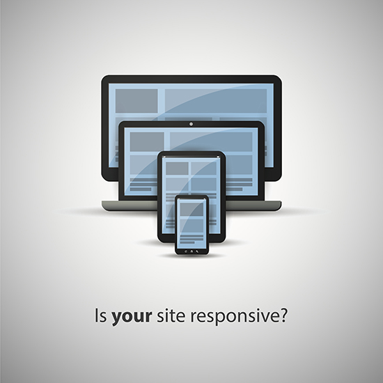 With the rise in popularity of mobile devices, responsive Web design has become essential. Responsive design is a way to make websites display and work well on any device, so developers don’t have to create different websites for each type of device. Whether the visitor to the website is on a desktop, laptop, tablet or smartphone, your website needs to look professional and give the user what he or she is looking for. Here are just a few other reasons why responsive design is important:
What Visitors Need
The main reason businesses should develop responsive design websites is to convert visitors into paying customers. It is becoming more common for people to purchase items via their mobile device. An infographic from Visual.ly claims that 69 percent of tablet users have purchased something on their device in the last 30 days, and that 67 percent of visitors are more likely to purchase something on a mobile-friendly website over a non-mobile friendly site.
Responsive design makes the website mobile friendly by optimizing the design, content and graphics to fit the screen size of any device. This means the visitor does not need to do any more work than is necessary—all of the content fits on the screen without having to zoom in or out or scroll back and forth. Responsive design also enables developers to create an appropriate design for any number of devices that differ slightly in size. This means that they don’t have to design separate sites for different sizes of mobile devices such as the 5.6-inch HTC One M8 or the 4.7-inch iPhone 6.
Responsive design also helps prevent high bounce rates. When a website does not load fast enough or look like the normal desktop design, users quickly leave. This not only means that you lose out on their business, but you also could be penalized by Google for the quick bounce rate. Search Engine Journal explains that Google might “interpret this high bounce rate as a sign that a website isn’t offering relevant content to users, which is likely to lead to a drop in rankings.”
What Google Says
Another reason why responsive design is important is because Google says so. The search giant recommends responsive-design websites, and that is essential for being found on the Internet. Google specifies that sites should serve all devices on the same set of URLs. This means that you should not have different web addresses for your desktop or mobile sites. Google prefers responsive design because it is easier for the Google bot to crawl and index one site than multiple sites. Furthermore, Search Engine Land reports that it helps Google’s algorithms assign indexing properties.
Search Engine Journal explains that having one site (rather than a desktop and a mobile site) helps your SEO because you only need to build the authority for one. This way, you can maintain your backlinks, keywords, metadata and other important factors without splitting your focus. Additionally, you only have one Web address to share on social media, which means that when others share the link, all of the content and images will be clear on any device and the viewer can easily share it as well.
 Delicious
 Digg
Digg StumbleUpon
 Propeller
 Reddit
 Magnoliacom
 Newsvine
Social Tracking
Comments
Post new comment