Breakdown of grant applicants by business sector
Submitted by Jordan on Thu, 11/13/2008 - 16:31
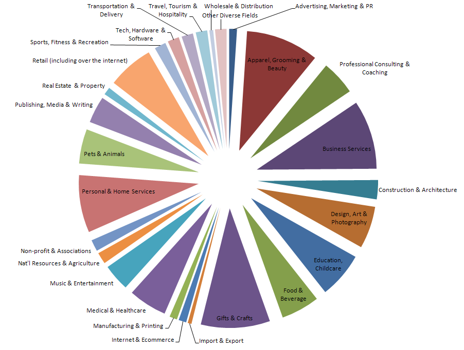
As we were going through the long list of grant applications, it struck me how diverse the business ideas in that list were. While we will no doubt be getting more interesting details about our finalists and their companies, here is a fist look at the composition of the line-up of applicants.
The graph is based on about 75% of the data and is an approximation, but it does provide valid insight about the types and relative number of companies and individuals that applied. Click on the thumbnail below for the full image.
A reminder: the selection of semi-finalists will be announced in less than two weeks.
Bookmark/Search this post with:
 Delicious
 Digg
Digg StumbleUpon
 Propeller
 Reddit
 Magnoliacom
 Newsvine
Social Tracking
![]()
![]()
![]()
![]()
Comments
That's a nice pie chart.
That's a nice pie chart.
I agree. Even though no
I agree. Even though no figures are provided, it still took time to compile this chart. Good job!
Erica
http://www.ambassadorstouch.com
Post new comment